Introducing the New Advice from a 20 Something!
posted on January 13, 2017 | by Amanda Holstein
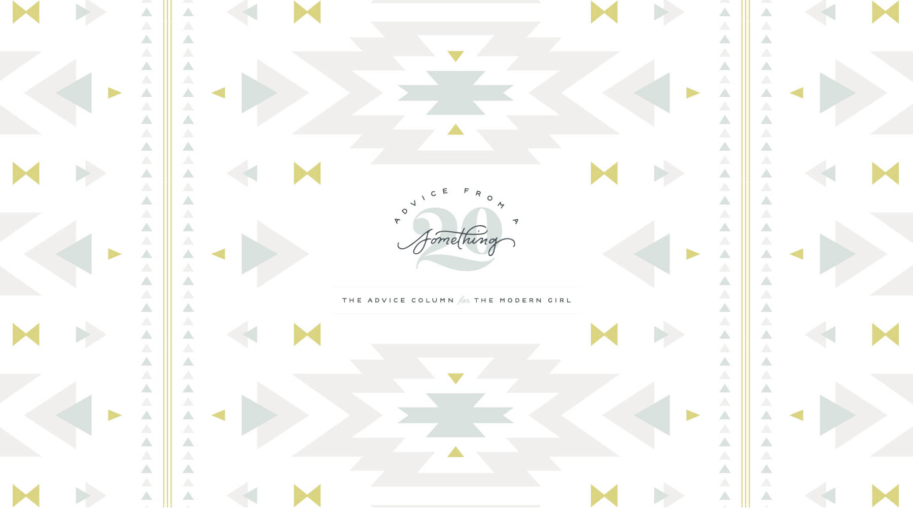
Notice anything different?
I’m SO excited to finally reveal the new look of Advice from a 20 Something!
I launched Advice from a 20 Something back in 2012. I’ve played with a few different website designs since then, but it wasn’t until 2016 that I decided to have a serious conversation with design experts and really nail down the brand identity of Advice from a 20 Something. The brand has always been about down-to-earth & friendly advice paired with a laid back California style. But now the look and feel of the site finally represent the content and the voice more accurately. Let’s dive into some of the changes, shall we?
New Logo
I worked with the amazing ladies at Spruce Rd. to design my new logo and I couldn’t be happier with the results. You’ll notice that “20”, which was hand-crafted by Melissa at Spruce Rd., appears in multiple locations on the site. The colors have transitioned to a cooler spectrum, which I feel better aligns with the brand’s imagery and style.
When trying to really clarify who the Advice from a 20 Something girl is, my designer asked me many questions. The one that stood out to me the most was, “Where does she shop?”. My answer? She’s an Anthropologie meets Madewell meets Free People kind of girl. Based on that, I’d say she totally nailed the design!
New Layout
Updating a site’s layout is not an easy task. But being able to find new content and navigate the site more easily were two major priorities of mine. Thanks to Chloé Digital, I was able to totally revamp the site layout, hopefully improving the experience for you. When looking on the homepage you’ll notice I kept the carousel where I’ll feature top posts from the current month. Below that, you’ll find the five most recent posts. Below that, you’ll see a peek at the latest posts from my Instagram. And finally, I’ll feature four more posts below that, each from different categories of the site. You’ll also find the “Ask Amanda” form towards the bottom of the page at all times so that you can submit a question at any time! To continue viewing the latest posts, just click “next” at the bottom right of the homepage.
New Navigation
My goal when updating Advice from a 20 Something was also to make the site easier to use. For returning readers, I wanted to organize the content better and encourage you to explore past posts with easier functionality (check out that new navigation bar!). I provided more content on the homepage as well, so if you like to check the site everyday, you’ll find more content besides the one new post of the day. For new readers, I wanted to make it easier to understand what Advice from a 20 Something is about right off the bat. More content on the homepage and easier navigation were both meant to help with that.
A HUGE HUGE HUGE thank you to both Spruce Rd. for their incredible branding work
and to Chloé Digital for designing and building the site exactly how I wanted it. Thank you, thank you!!
I would SO love to hear your thoughts on the new logo, layout, navigation — anything at all.
The updates were all for YOU to better enjoy the site, so your opinions mean the world to me!
 Using Trunk Club to Update My Spring/Summer Wardrobe
 5 Tips For Styling a Simple Summer Dress
 5 Ways to Style a Bandana
 3 Different Ways to Curl Your Hair
 How to Master the 5-Minute Makeup Routine
 Amazon Beauty Buys Under $25
 3 Ways to Make Your next Trip More Memorable
 Tips for Digital Spring Cleaning and Organizing
 Color Trend: Marigold
 Mental Health Update: The 3 Major Changes I Made to Get Out of Depression
 5 Unexpected Ways to Unwind After Work
 How to Know You’re in a Controlling Relationship
 4 Questions I get Asked as a Professional Resume Writer
 How to Make Friends at Work
 Getting Out of the ‘Busy’ Mindset
 Ask Amanda: How do I pursue the career I want without formal training?
 Ask Amanda: How Do I Find a Therapist?
 Ask Amanda: How do I stop being jealous in my relationship?


Elana L. Gross Says
Your site looks so beautiful, Amanda! Congratulations!!!
Amanda Says
Post authorThank you, Elana!!! So happy to hear you like it! :)
Elizabeth Mayberry Says
Congrats! It looks amazing!
Z Says
Your site looks beautiful! Just had a question and I hope it’s not taken in a bad way… What will happen to the name of the blog when you are not in your 20s anymore? Just curious. :D
Amanda Says
Post authorI actually get this question all the time! I have “Advice from a 30 Something” waiting on the wings for when the time comes. I’m hoping to be able to run both sites for both age groups!
Jess Says
Wow – such a dramatic update! Congrats on taking the plunge to do a revamp – I love the new logo. :)
Amanda Says
Post authorThanks, Jess!! So glad you like it!!
Christina Says
New site looks AMAZING! Love it. I’m hoping to do a redesign at some point this year, and was considering Chloe Digital! I just may hit them up after all :)
Christina | http://www.cuddlepill.com
Jess Says
You are literally my West Coast sister from another mister. I love your new site and branding and everything about the content that you create. Congrats on this next step girl. xx
Amanda Says
Post authorAwww thank you so much, Jess!! Means so much coming from you! I feel the same way :). Can’t wait to meet someday! xx
christa Says
Looks amazing!! LOVE your logo!
xo christa | http://www.gardeniasandmint.com