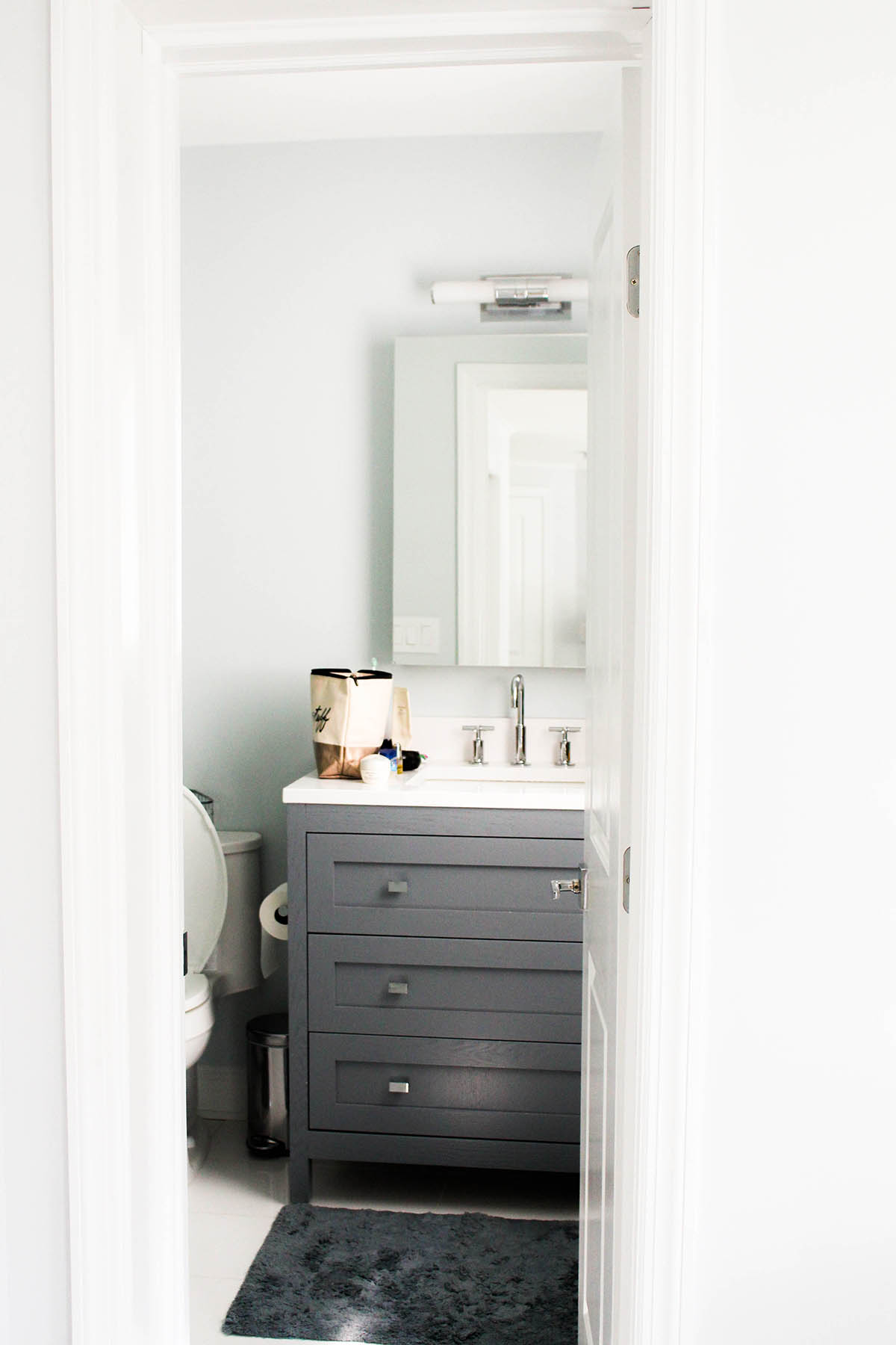
I’ve always admired beach style in both interiors and fashion, but it wasn’t until my recent trip to The Hamptons that I discovered what a beach house is supposed to look like. Often times, people go way too far with the coastal theme, taking it too literally with shells, sail boats, and the like. But this house took that relaxing beach vibe and turned it into beautiful interior design.
The Kitchen & Dining Area
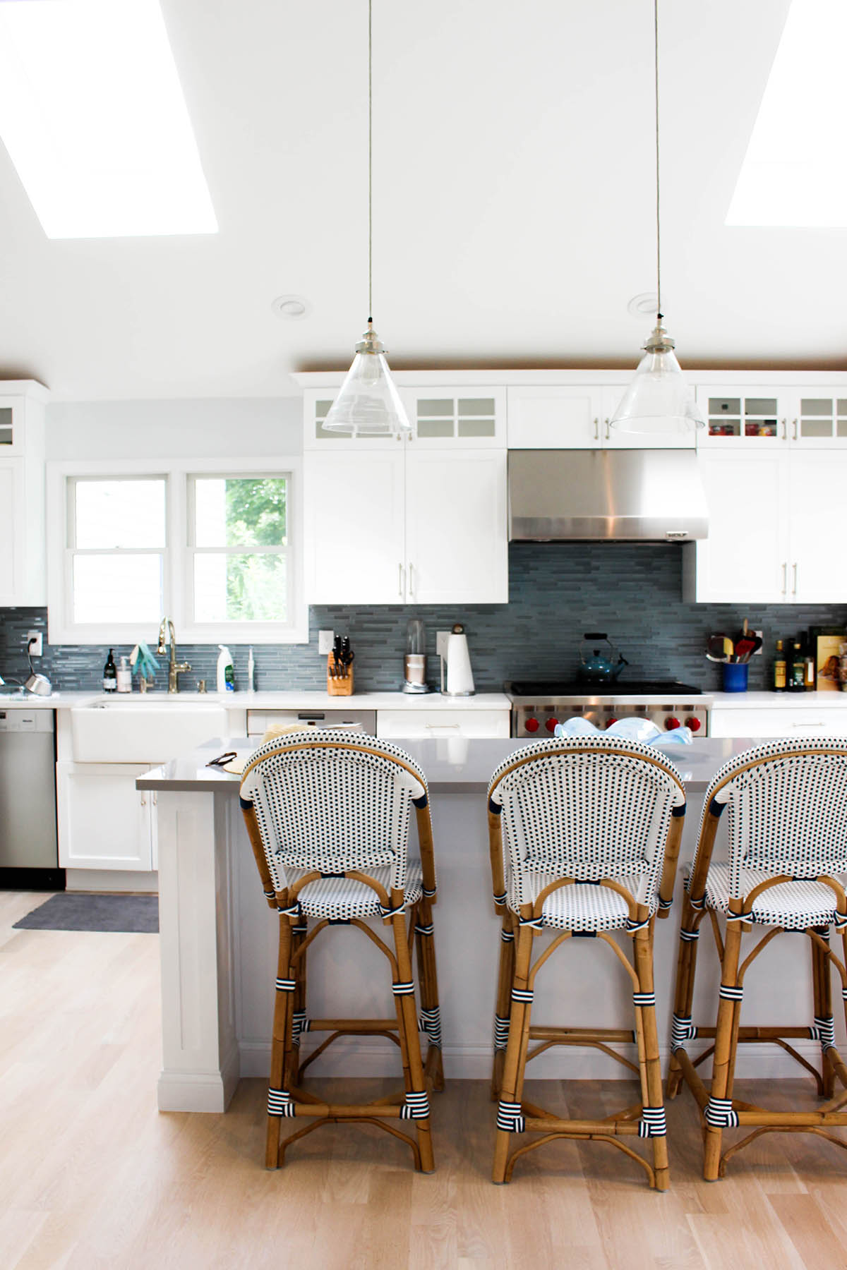
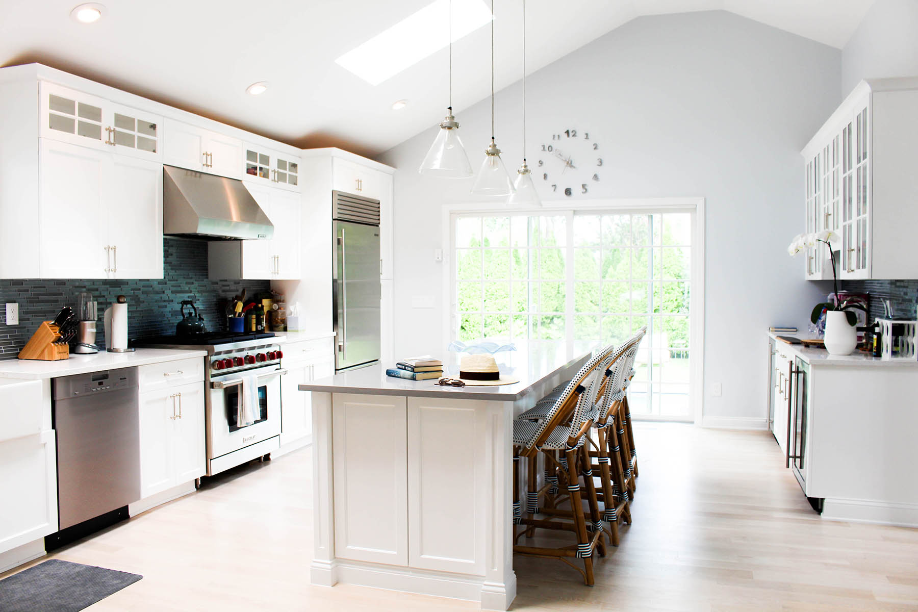
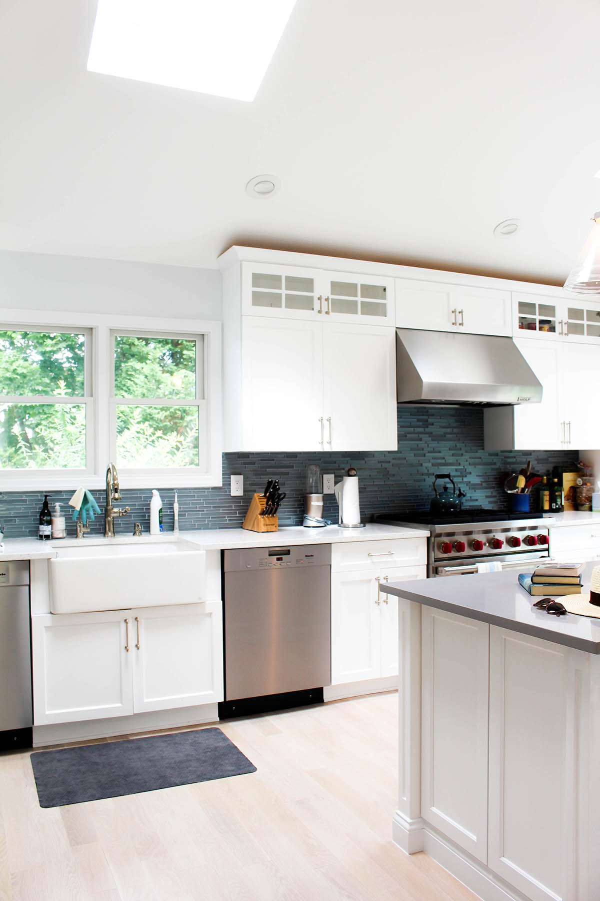
When you walk into the house, the entire first floor is one large room. The kitchen is nice and open with white cabinets, but they played up the beach vibe with a unique ocean-like backsplash. I’m also obsessed with those bar stools (as you may have seen from this post) and love how they give the room some character.
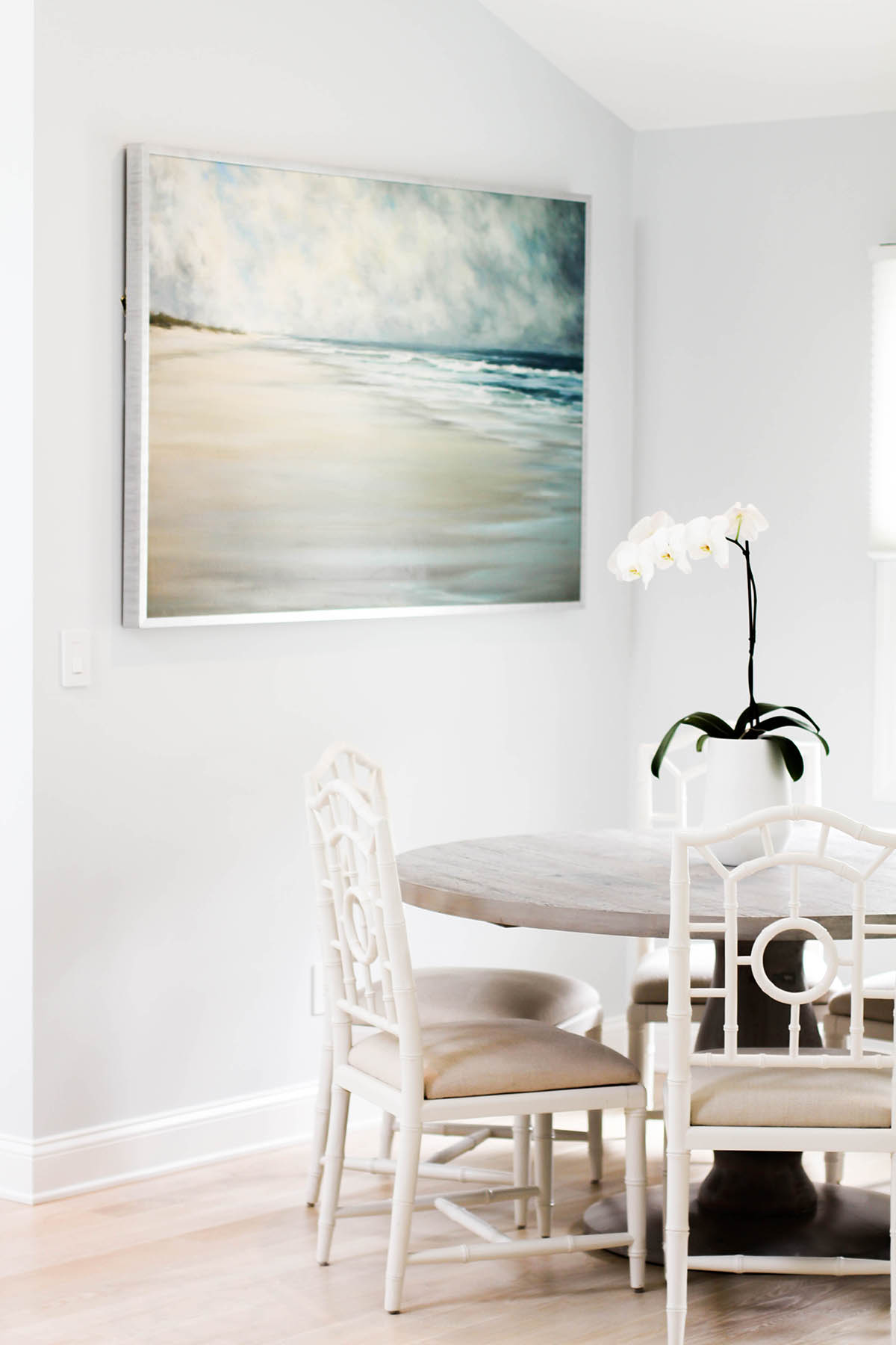
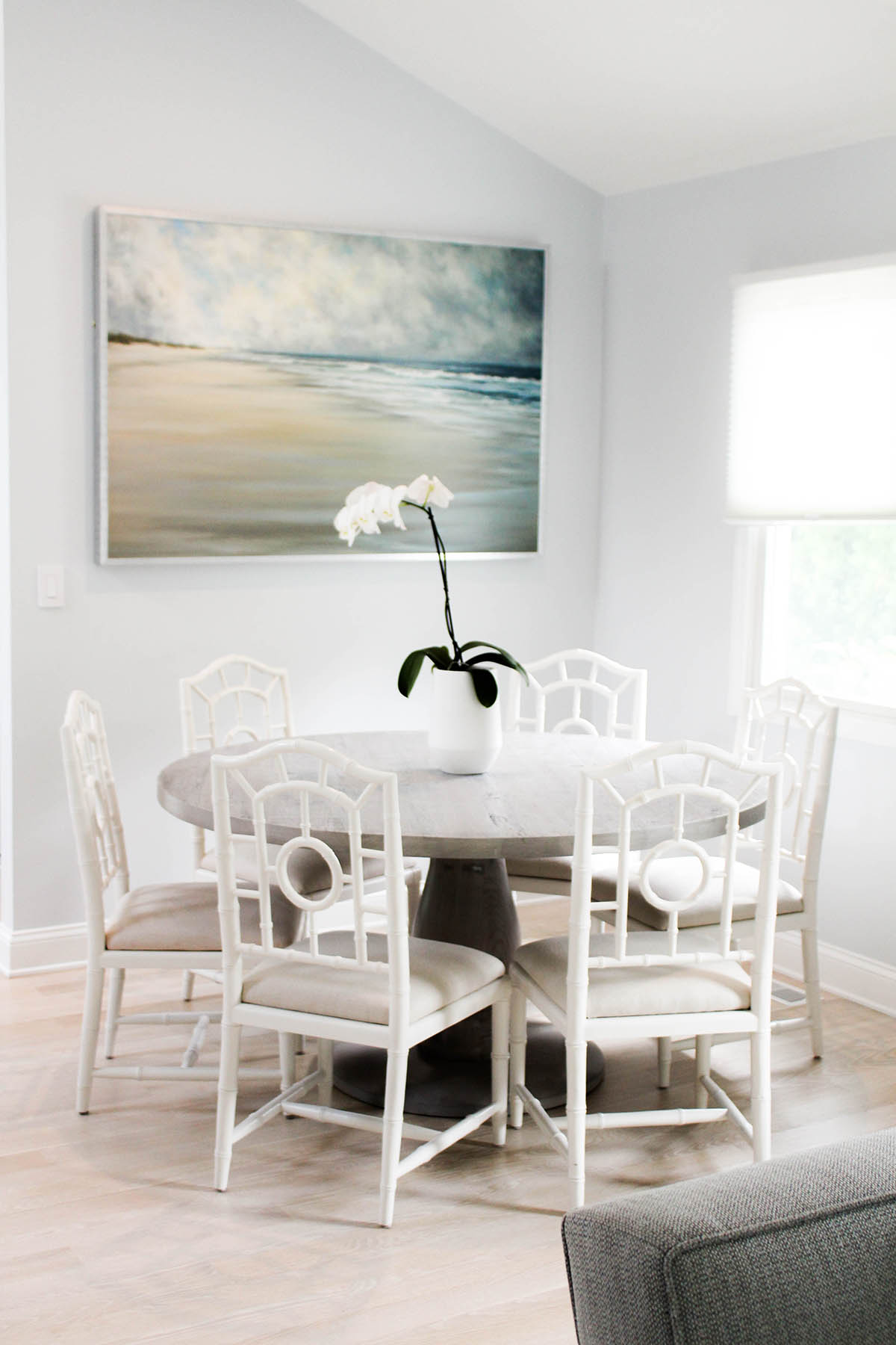
The dining area is an easy transition from the kitchen, with similar soft hues. I love that faded gray wood table! The painting was a great way to tie the whole space together as well. Choosing artwork that contains all the colors of your space is key to making a room feel complete.
The Living Room
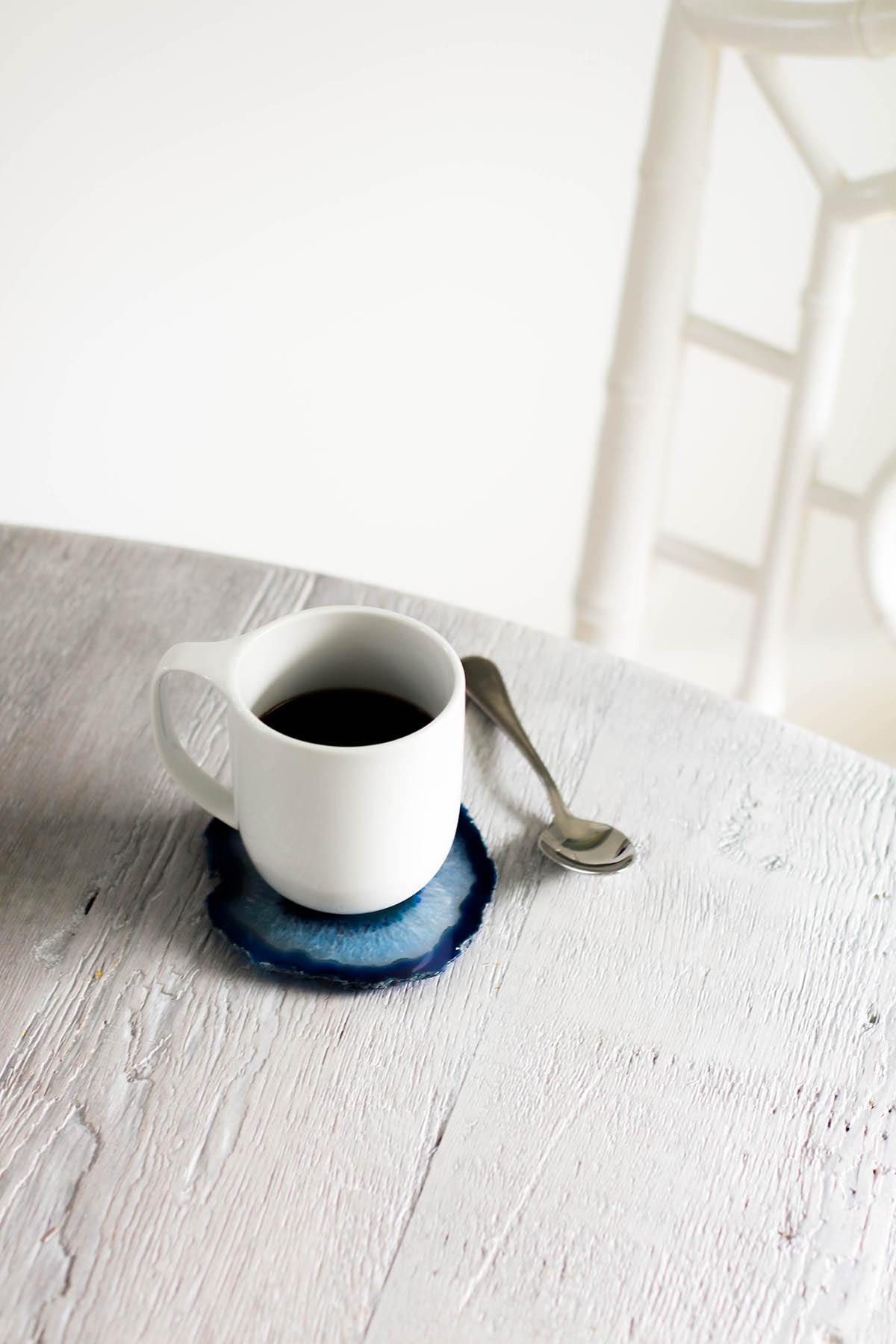
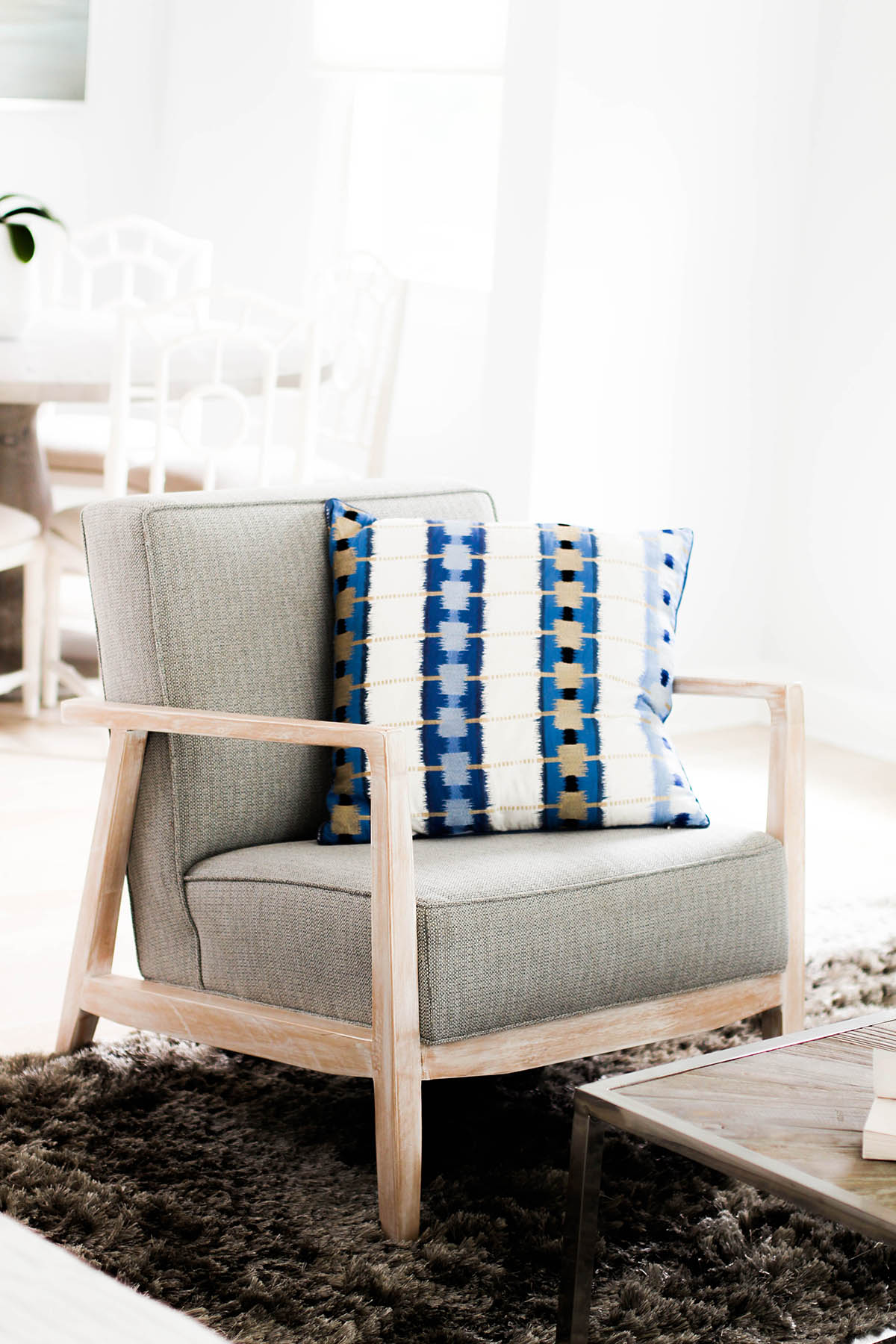
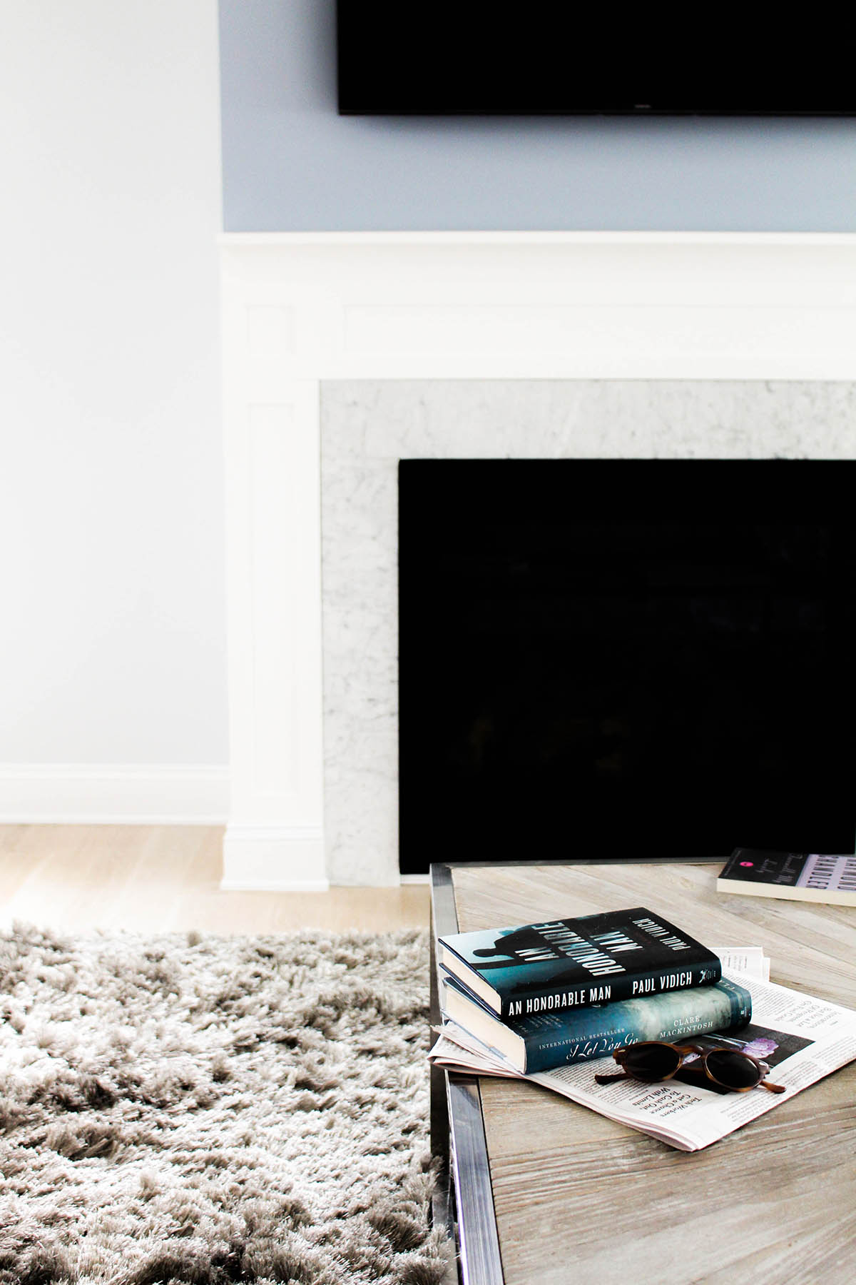
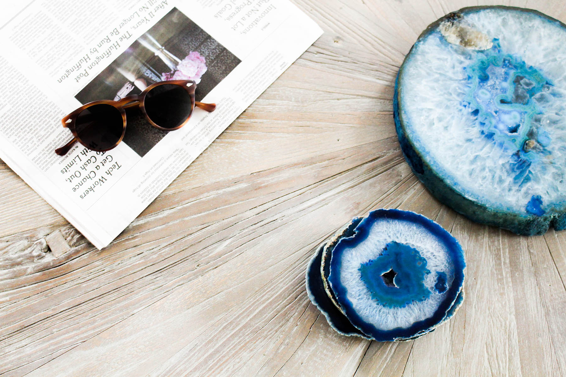
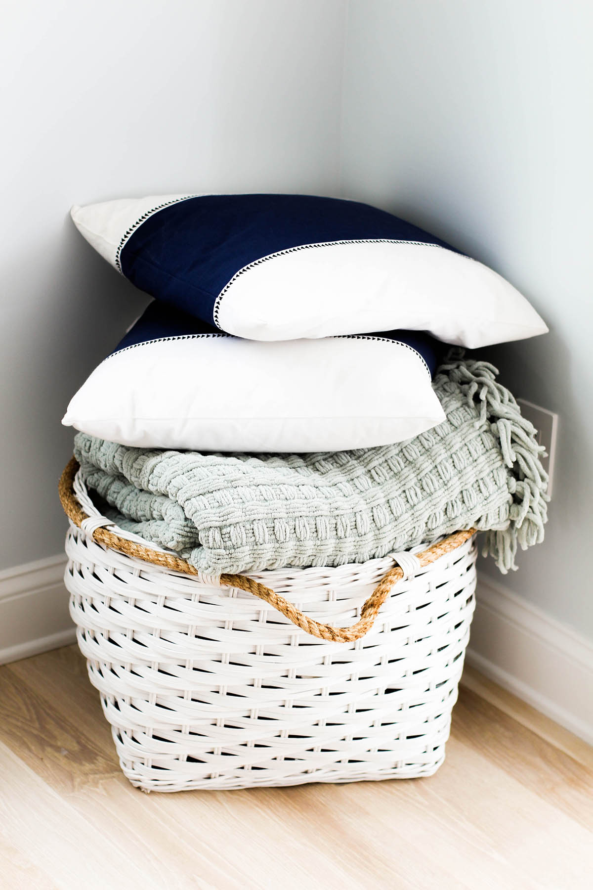
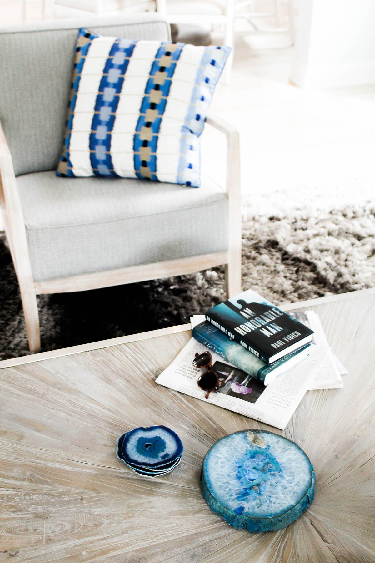
The colors used in the living room are also consistent with the kitchen area, making the space cohesive. They brought in more gray to use as a backdrop (the rug and coffee table) and incorporated faded wood to tie in with the dining room. Then they added pops of color and print with pillows and accessories. I’m in love with those coasters (which I found here)!
The Bedrooms
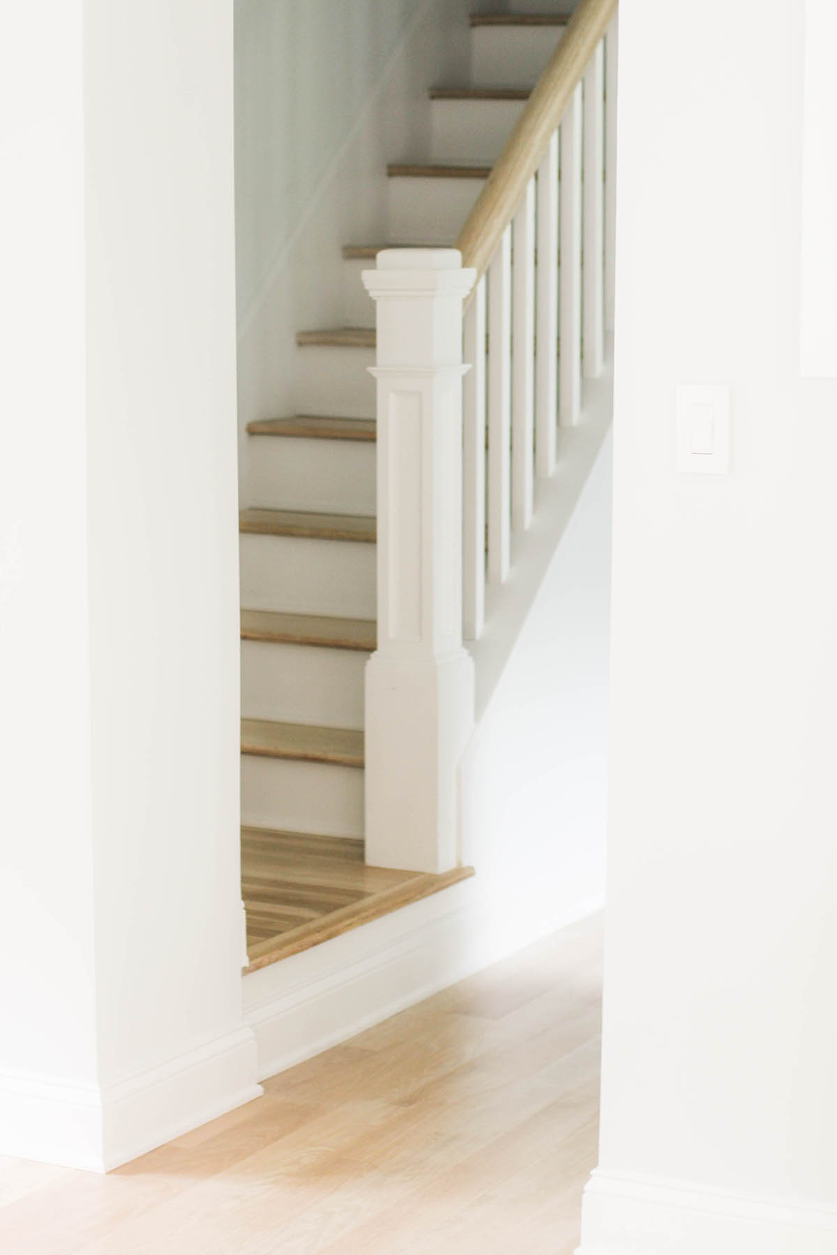
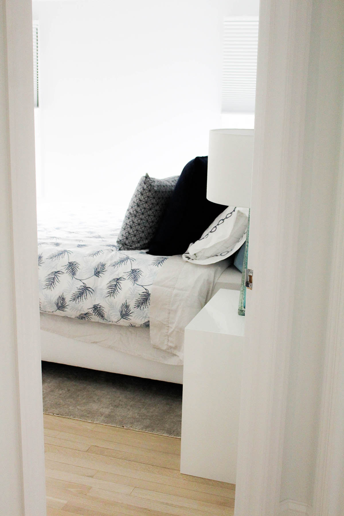
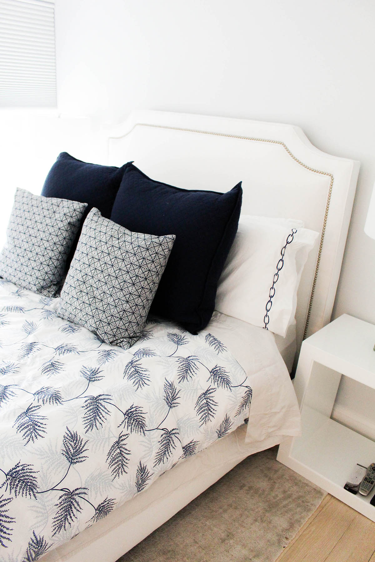
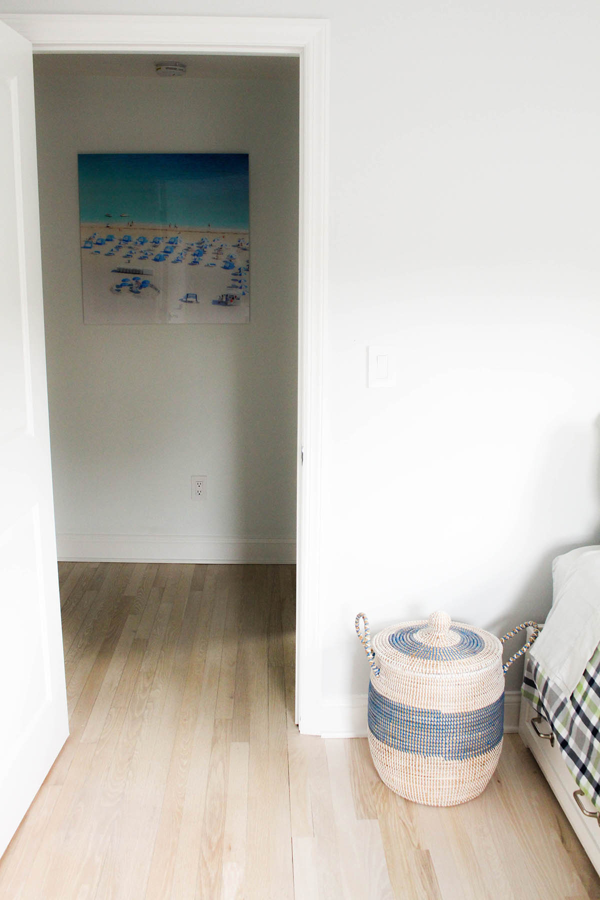
I was in love with those clean white and pine wood stairs leading up to the bedrooms. They are so soft and simple — the perfect base for a beach home. The bedrooms tied in the same color palette as the downstairs, but incorporated more prints and textures. The designer also chose to use the same wall color throughout the whole house (a STUNNING, soft gray-blue), and the same pine wood floors. Both make the home feel cohesive and coastal chic.
 Using Trunk Club to Update My Spring/Summer Wardrobe
 5 Tips For Styling a Simple Summer Dress
 5 Ways to Style a Bandana
 3 Different Ways to Curl Your Hair
 How to Master the 5-Minute Makeup Routine
 Amazon Beauty Buys Under $25
 3 Ways to Make Your next Trip More Memorable
 Tips for Digital Spring Cleaning and Organizing
 Color Trend: Marigold
 Mental Health Update: The 3 Major Changes I Made to Get Out of Depression
 5 Unexpected Ways to Unwind After Work
 How to Know You’re in a Controlling Relationship
 4 Questions I get Asked as a Professional Resume Writer
 How to Make Friends at Work
 Getting Out of the ‘Busy’ Mindset
 Ask Amanda: How do I pursue the career I want without formal training?
 Ask Amanda: How Do I Find a Therapist?
 Ask Amanda: How do I stop being jealous in my relationship?




Pingback: 8 Things to Do Before Summer Ends | Advice from a Twenty Something
Polly Says
After all, the light in this room should work both for comfort during meals and for your convenience and safety during cooking. Achieving such a balance is not so easy, the task requires a comprehensive approach. On this site https://www.staticelectrics.com.au/electricians-blog/kitchen-lighting-ideas/ you can find the best ideas for lighting your kitchen. When calculating the luminous flux of all the lamps in the kitchen, it is worth considering natural lighting, the color of the walls and furniture, and the size of the kitchen itself